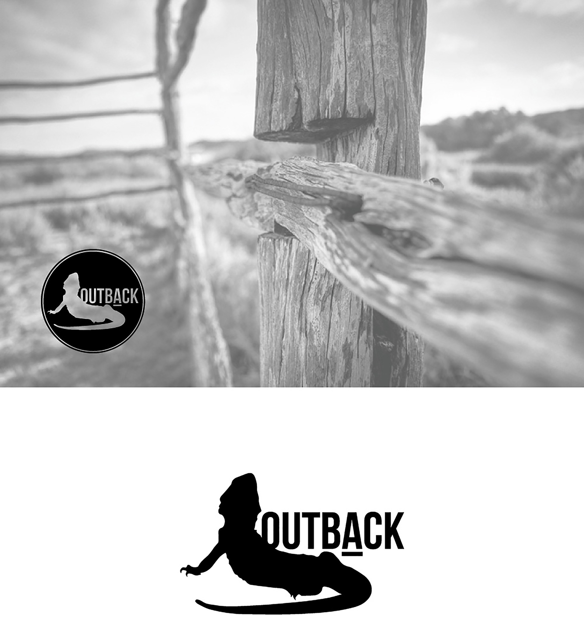
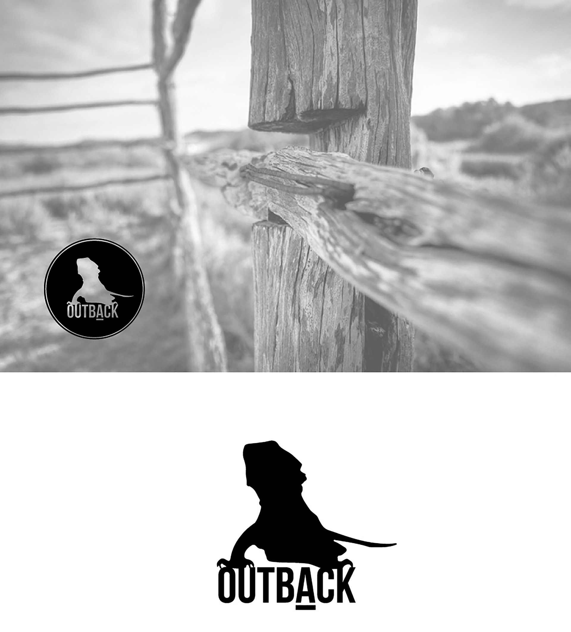
Logo Design The client's vision entailed a straightforward design featuring the word "OUTBACK" for corporate and high end purchasing clients, possibly overseas. The text needed be in uppercase, lowercase, or a combination of both, allowing for versatility. Alongside the text, they desired a simplified representation of a frilly lizard, also known as a bearded dragon. This lizard needed to be depicted using clean lines, resembling a silhouette or a block-like shape, while still retaining its distinct features. Its lengthy tail coiled around it, and positioned to face either the viewer or the distant horizon. For the color scheme, the entire logo, encompassing both the word and the lizard, they wanted it to be solid black with no shading or intricate detailing, keeping the design minimalistic. The primary objective was to convey a sense of vastness, emptiness, and isolation. By adhering to these guidelines, the logo will effectively evoke emotions related to space, nothingness, desolation, and the remote expanses of the outback. The client expressed immense satisfaction with both logos, resulting in her decision to purchase both of them.