The logo design and brand identity I created for Edward Dillon Photography, situated in Ile-Perrot, QC, Canada, is a true reflection of the art and principles of photography. It elegantly combines the essence of the craft with a clever play on the photographer's name, resulting in a unique and memorable visual identity.
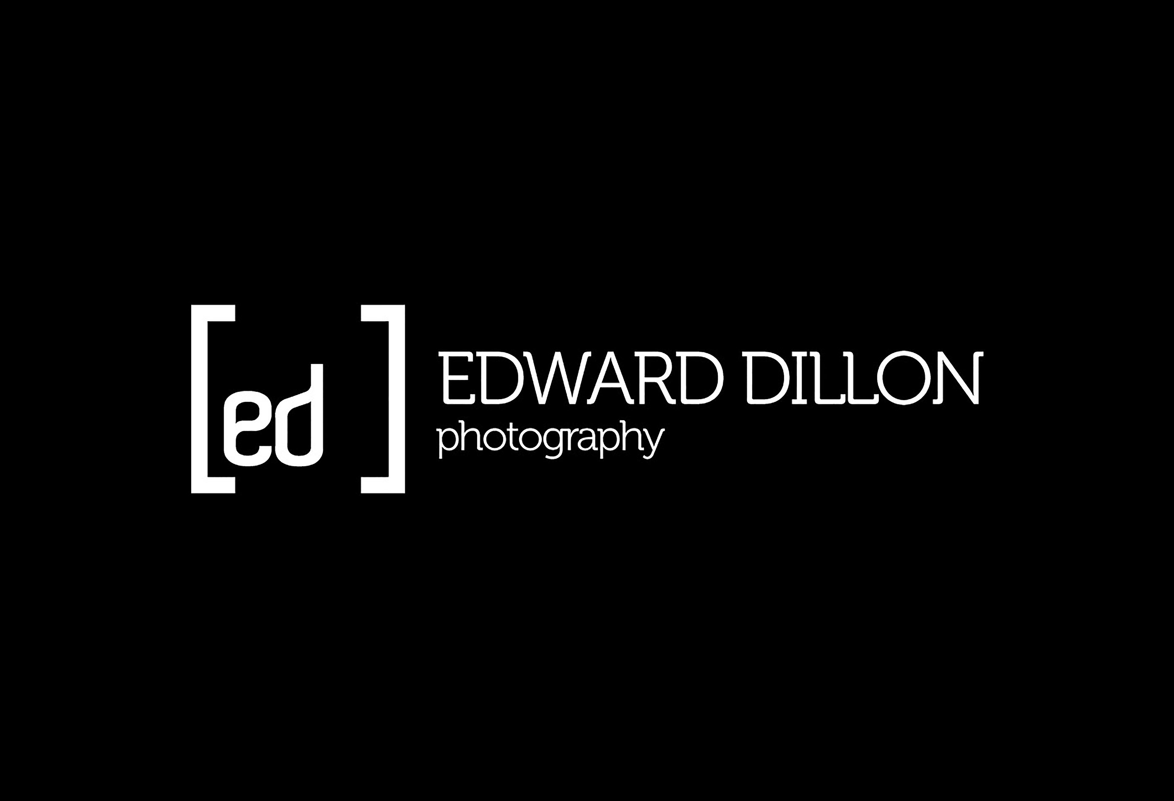
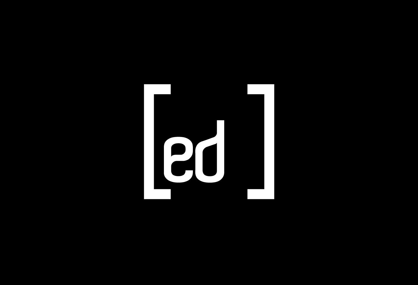

The centerpiece of the logo design is inspired by the rule of thirds, a fundamental composition principle in photography. The rule of thirds divides an image into a grid of nine equal parts using two equally spaced horizontal and two equally spaced vertical lines. This concept not only adds a touch of creativity but also reflects Edward Dillon's deep connection to the art and craft of photography.
The lens frame encircling the rule of thirds grid brings a sense of focus and precision to the logo, symbolizing the photographer's commitment to capturing moments with utmost clarity and artistry. The lens frame serves as a visual reminder of the lens through which Edward Dillon views the world, capturing moments that tell a thousand stories.
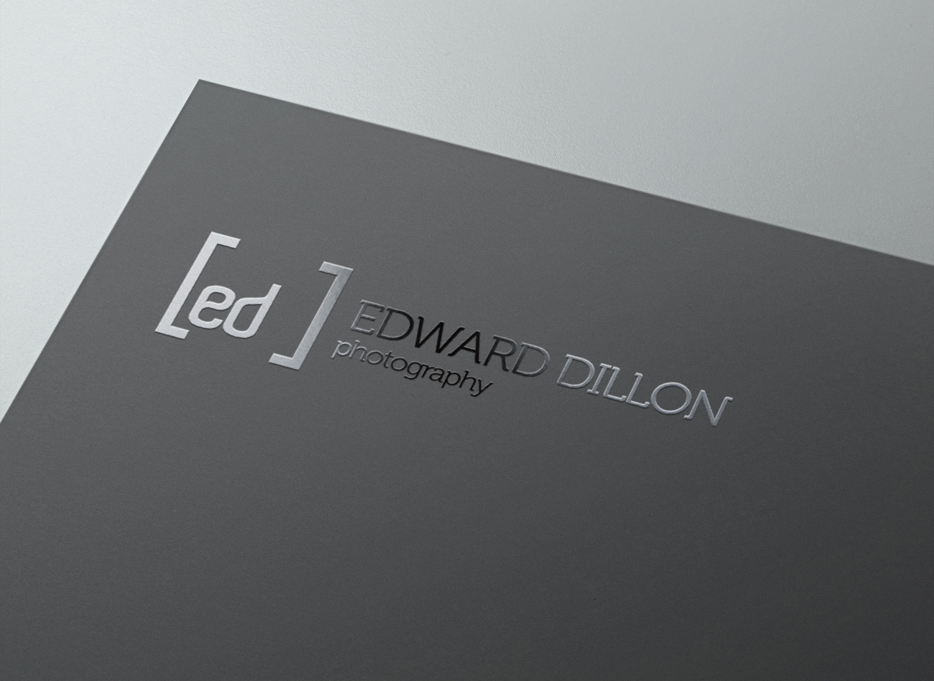
A brilliant stroke of creativity lies in the clever use of the first letters of Edward Dillon's first and last name to create an abbreviation that spells out his name in short. This ingenious approach adds a personalized touch to the logo, forming a strong and distinct brand mark that is easily recognizable and memorable.
The overall design is kept simple, clean, and modern, reflecting a professional and sophisticated brand identity. The simplicity of the logo ensures versatility, making it effortlessly adaptable across various applications, from business cards and photography watermarks to social media profiles and website branding.
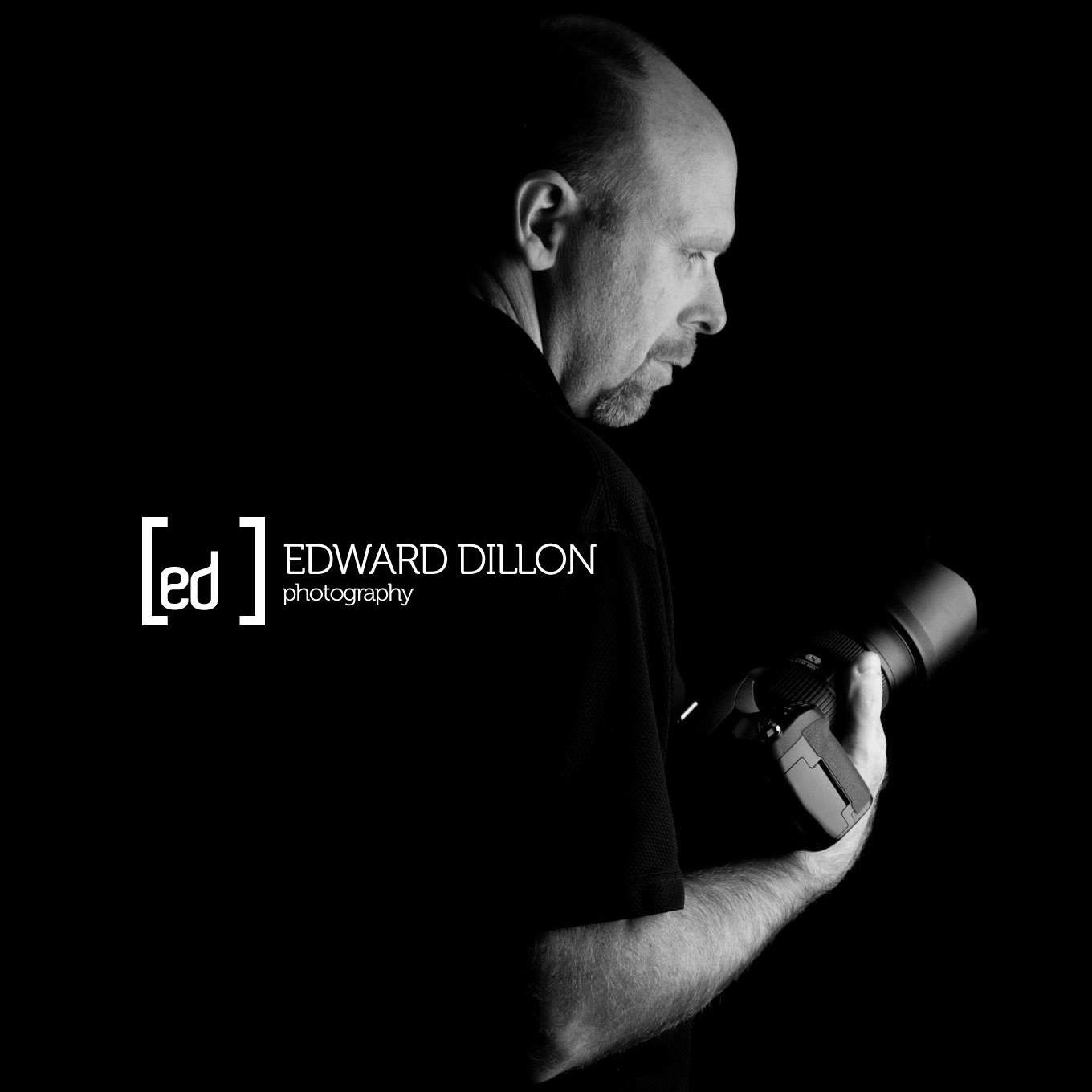
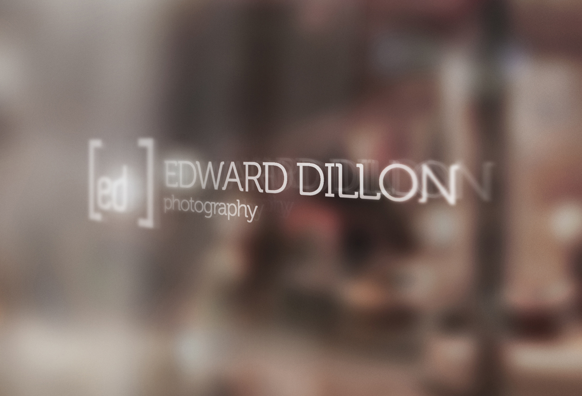
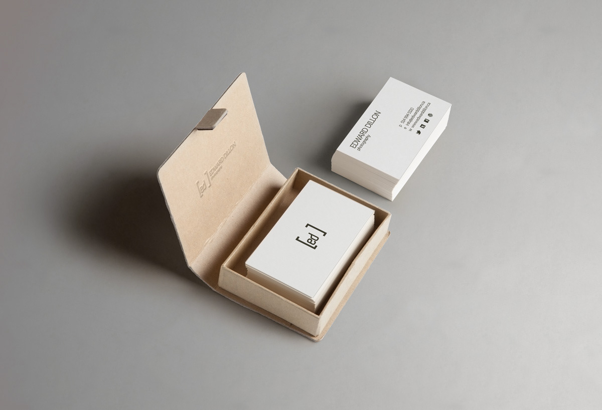
The brand identity extends beyond the logo, creating a cohesive visual language that is carried throughout Edward Dillon Photography's marketing materials, including business cards, letterheads, website design, and social media graphics. This consistency helps establish a strong and memorable presence in the photography industry in Ile-Perrot and beyond.

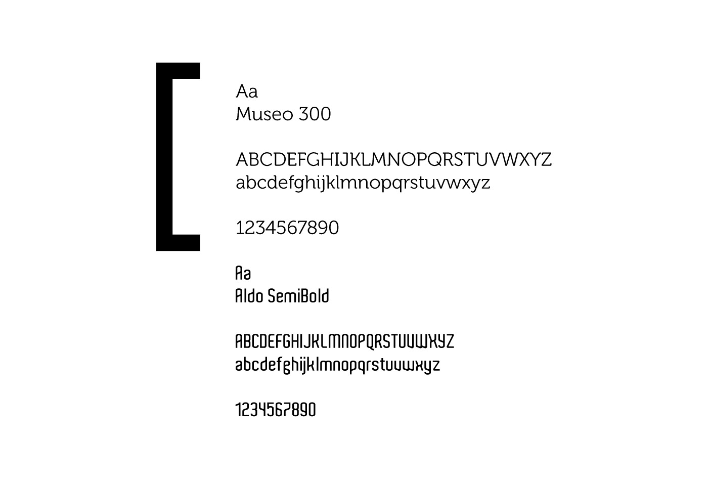
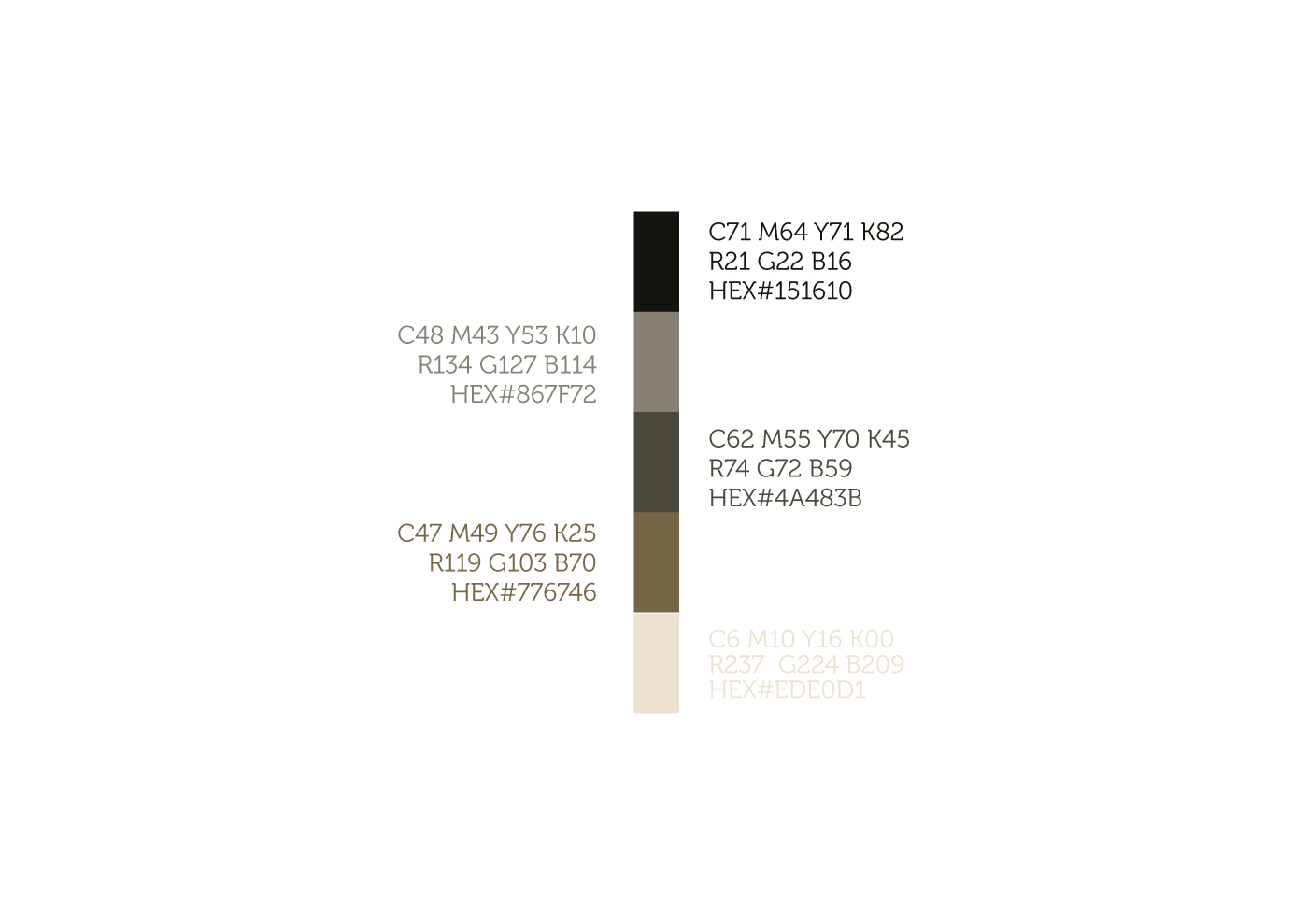
The color palette and font chosen for the logo design complements the elegance and modernity of the brand identity. Subtle and sophisticated colors are used to evoke a sense of professionalism and timelessness.
In conclusion, the unique logo design and brand identity I created for Edward Dillon Photography showcase a seamless fusion of photography principles and creativity. The rule of thirds and lens frame elegantly represent the art of photography, while the clever play on the photographer's name adds a personal touch. The simplicity and modernity of the design contribute to the logo's versatility and timeless appeal. This distinct brand identity sets Edward Dillon Photography apart and positions it as a reputable and remarkable photography service in Ile-Perrot, QC, Canada, and beyond.