The design process for Streppy Clothing's brand identity, a UK-based laid-back sportswear brand for high schools focused on comfort, is a journey marked by simplicity, memorability, and a distinct expression of the brand's essence. The aim is to create a visual identity that resonates with the target audience, capturing the essence of relaxed and comfortable sportswear while establishing a lasting impression.
The first step in the design process was thorough research and understanding of Streppy Clothing's brand values, target audience, and unique selling points. This groundwork ensured that the design aligned perfectly with the brand's vision and mission.
With a clear vision in mind, I explored various font options to find the perfect fit for Streppy Clothing's personality. The hand script font is chosen for its casual, approachable, and friendly appeal, evoking a sense of ease and comfort synonymous with the brand's laid-back sportswear style.
Next, the focus was on creating a logo that was both simple and memorable. The decision to encapsulate the logo within a circle was deliberate, as it represents unity, continuity, and a sense of inclusivity. The circle also symbolizes the brand's commitment to providing a complete and all-encompassing sportswear experience for its customers.

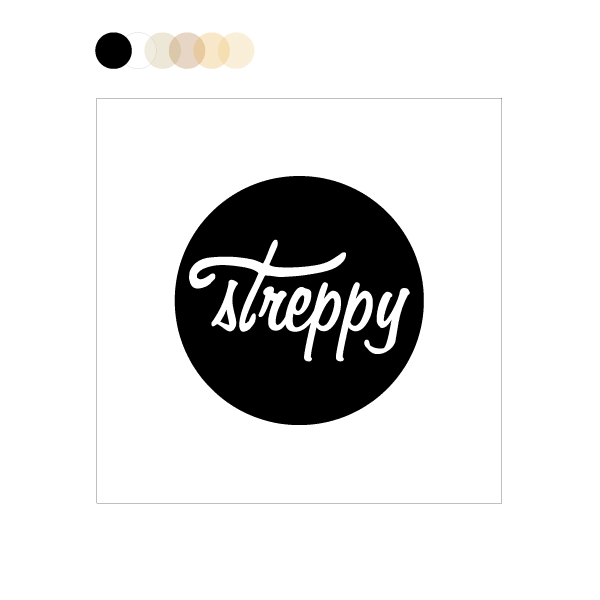
The chosen color palette complements the brand's identity, utilizing colors that evoke a sense of tranquility and ease. Soft and soothing shades are selected to create a serene and approachable feel, making customers feel comfortable and confident in choosing Streppy Clothing for their sportswear needs.
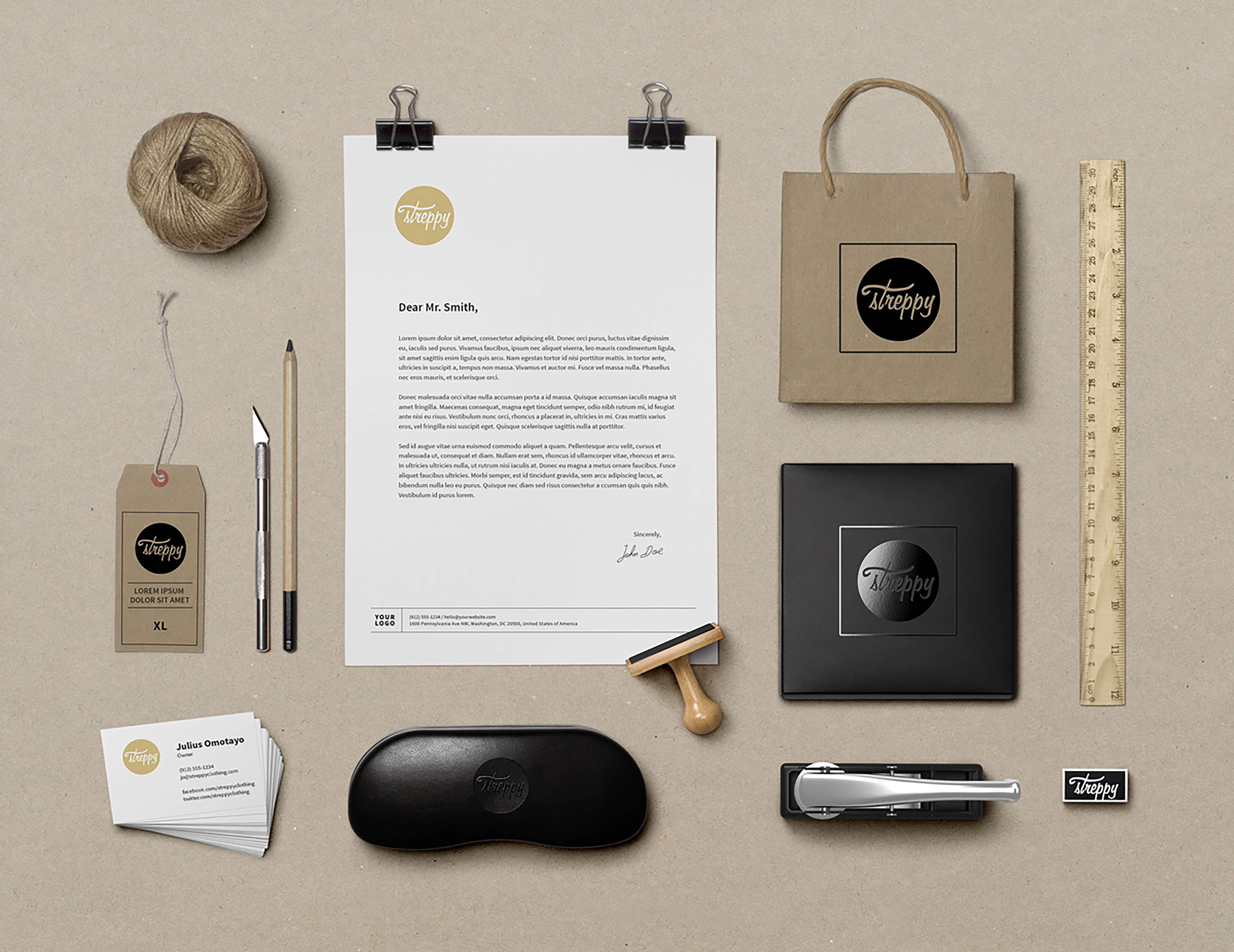
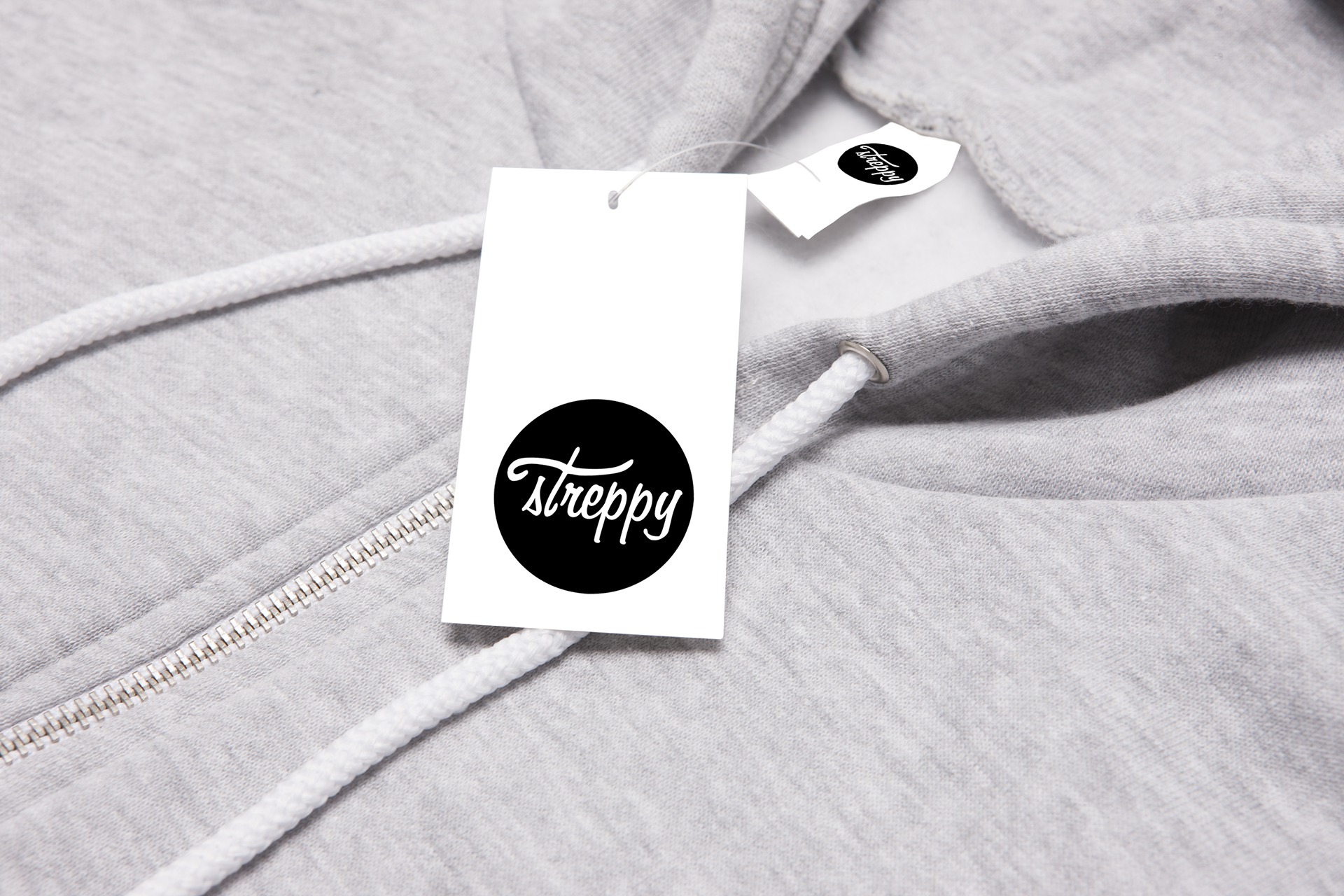
During the design process, I remained focused on ensuring that the logo design is versatile and scalable, making it suitable for various applications, such as clothing tags, labels, website banners, stationery, and social media profiles.
Throughout the process, feedback from stakeholders and target customers was actively sought and incorporated into the design, ensuring that the final result resonated deeply with the intended audience and accurately reflects the brand's essence.
In conclusion, the design process for Streppy Clothing's brand identity is a carefully crafted journey that prioritizes simplicity, memorability, and a clear expression of the brand's values. The hand script font, encapsulated within a circle, captures the essence of laid-back comfort, while the carefully chosen color palette adds a touch of serenity and approachability. The end result is a visually captivating and meaningful logo that successfully communicates Streppy Clothing's unique brand identity and creates a strong foundation for its presence in the sportswear market in the UK.